Salesforce provides powerful reporting and dashboard capabilities to help businesses make informed decisions based on real-time data. Reports allow users to access and analyze data in a variety of ways, while dashboards provide a visual representation of that data.
Reports in Salesforce:
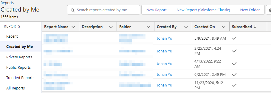
Reports in Salesforce allow users to analyze data based on a set of criteria and display the results in a tabular or summary format. Reports can be created on any object in Salesforce, and can include fields from related objects as well.
To create a report, users can choose from several report types based on the data they want to analyze. Once a report type is selected, users can further customize the report by adding filters, sorting and grouping data, and selecting the fields to include in the report. Reports can also be scheduled to run at specific times or intervals, and can be emailed or exported in various formats.

Report Types:
Salesforce provides a variety of report types to help users analyze data in different ways. Each report type is designed to provide insights into specific aspects of business performance, and can be customized with filters, grouping, sorting, and calculations to meet specific needs. Here are some of the most common report types in Salesforce:
Tabular Reports: Tabular reports provide a simple, column-based view of data. They are ideal for viewing large amounts of data in a structured format and can be customized with filters and sorting to focus on specific data sets.
Summary Reports: Summary reports provide a higher-level view of data by grouping it into categories and providing subtotals. They are useful for analyzing data across different dimensions and can be customized with grouping, sorting, and calculations to provide additional insights.
Matrix Reports: Matrix reports provide a multi-dimensional view of data by summarizing it in rows and columns. They are ideal for comparing data across different dimensions and can be customized with grouping, sorting, and calculations to provide additional insights.
Joined Reports: Joined reports combine data from multiple report types into a single report. They are useful for comparing data across different objects and can be customized with grouping, sorting, and calculations to provide additional insights.
Historical Reports: Historical reports provide insights into data over time by tracking changes to data fields. They are useful for analyzing trends and can be customized with grouping, sorting, and calculations to provide additional insights.
Forecast Reports: Forecast reports provide insights into sales performance by predicting future revenue based on historical data. They are useful for sales teams and can be customized with grouping, sorting, and calculations to provide additional insights.
Cross Filters Reports: Cross filter reports provide insights into data across multiple objects by filtering data based on related objects. They are useful for analyzing complex data relationships and can be customized with grouping, sorting, and calculations to provide additional insights.
Dashboards in Salesforce:
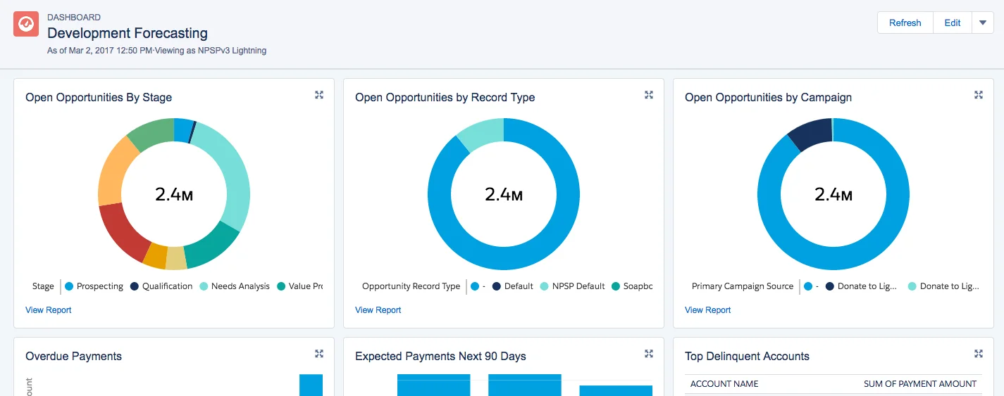
Dashboards in Salesforce provide a visual representation of data that can help users quickly understand key business metrics and trends. Dashboards are made up of one or more components, which can include charts, tables, gauges, and other visualizations.
To create a dashboard, users can select the data they want to include in the dashboard and choose from a variety of component types to display that data. Components can be customized with filters and other options, and dashboards can be shared with other users or groups.

Types of Dashboard:
Salesforce offers several types of dashboards that users can create to visualize data and monitor key metrics. Each dashboard type is designed to cater to different reporting needs, and each one can be customized with different components, filters, and other settings. Here are some of the most common types of dashboards in Salesforce:
Standard Dashboards: These dashboards are pre-built by Salesforce and are included in the platform. They provide a set of standard components that display data in various formats, such as tables, charts, and gauges. Standard dashboards are customizable, and users can choose which components to include, how to filter data, and how to group and summarize data.
Custom Dashboards: Custom dashboards are built by users from scratch. They allow users to create a tailored view of data based on their specific business needs. Custom dashboards can include any combination of standard components or custom components created by the user or a developer.
Dynamic Dashboards: Dynamic dashboards allow users to personalize the data displayed in the dashboard based on their role or other criteria. They provide a set of filters that allow users to modify the data displayed in the dashboard without changing the underlying components.
Operational Dashboards: Operational dashboards are designed to help users monitor real-time data and identify issues quickly. They are typically used by teams such as customer support, sales, and service to track their performance in real-time.
Analytical Dashboards: Analytical dashboards are designed to help users analyze data trends and make informed decisions. They provide a set of components that display data in various formats, such as charts, tables, and graphs. Analytical dashboards are customizable and can be used to visualize data from multiple sources.
Visualforce Dashboards: Visualforce dashboards are built using Salesforce's Visualforce framework. They allow developers to create custom dashboards using HTML, CSS, and JavaScript. Visualforce dashboards offer greater flexibility than standard or custom dashboards, but require more development expertise.
Best practices for using Reports and Dashboards in Salesforce:
Define clear business objectives: Before creating reports or dashboards, it’s important to define clear business objectives and determine the key metrics that will help track progress towards those objectives.
- Choose the right report type: Selecting the right report type is crucial to ensuring the report provides the necessary insights. Consider the data being analyzed and the specific questions being asked before selecting a report type.
- Keep it simple: Reports and dashboards should be easy to read and understand. Avoid cluttering them with too much information or overly complex visualizations.
- Use filters effectively: Filters can help narrow down the data being analyzed and make it easier to identify trends or issues. Use them wisely to ensure the most relevant data is being displayed.
- Share and collaborate: Reports and dashboards are most effective when they are shared and used collaboratively. Consider sharing reports and dashboards with other team members or departments to ensure everyone is working towards the same goals.
In conclusion, Reports and Dashboards in Salesforce are powerful tools that can help businesses make data-driven decisions. By selecting the right report types, customizing them with filters and other options, and creating visually appealing dashboards, users can gain valuable insights into key business metrics and make informed decisions.


